

Our classic look with a couple of modifications.

Helmet: C
I’m not a fan. I love the classic maroon helmet with no stripes look. I’ve never been a fan of the stripes on the helmet. They’re unnecessary and don’t add anything. Also, how many stripes do we need? When is enough? I hope we go back to the no stripe look. I hope this was just a one-time thing.
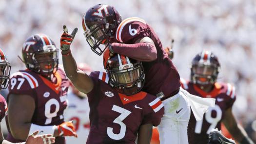
Jersey: C
I’m a fan of the shoulder stripes. Let’s start there. But I’m a fan because it’s a classic look. So it should go with the classic varsity-style numbers. Now we’ve got this new number font to go with a classic look. Now it just looks weird. Either go completely modern or go classic. But don’t do both.
Pants: B
Who am I to argue with plain white pants with a VT on one side and the Nike symbol on the other?
Overall: C+
I’ve seen worse. It’s a bit of a mismatched look and not my favorite but the Hokies have trotted out worse over the years. I’m never going to be too hard on a maroon helmet, maroon jersey and white pants.

Watched the replay! These units looked totally sharp! Sorry, but I loved them!
LikeLiked by 1 person