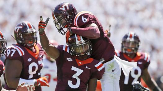


Helmet: A+
This is the best looking helmet the Hokies have worn. There is a VT on the helmet. The colors make sense. Black and gray were the original school colors. It incorporates the Hokie Stone. It looks modern. They hit it out of the park with this design.
Jersey: B+
It’s too much Hokie Stone. They could’ve done a better job of breaking up all the grey with more black accents or maroon accents. Unlike last week, the number font makes sense with this jersey. It’s supposed to look modern. This design is a little too basic for my liking but it still looks good.

Pants: A
These are the best looking pants since we played Boise State. The issues I had with the jerseys are fixed with the pants. It’s Hokie Stone accents. Not all Hokie Stone. Branded with a white VT outlined in maroon. Strong look.
Overall: A
Best look we’ve had since we played Boise State.